
Getail Design

An Innovative Sim-Racing Product Deserving of a Stand-out Visual Identity
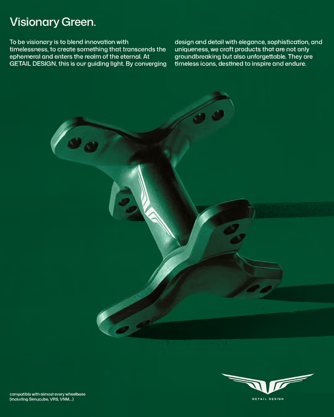
Getail Design is an Italian sim racing brand, premium, precision-milled components built for performance and aesthetics. Their stand out product, the G1, is a unique solution to the problem of monitor positioning above the steering wheel hub. As a lover of all things automotive, I was thrilled to take on the challenge of reimagining Getail's visual identity. Gianpaolo and I collaborated on developing a visual strategy to differentiate Getail Design from the rest of the sim racing market, dominated by tacky gaming aesthetics and a bland corporate tech feeling. Our solution: shift the focus from the gaming space to the world of heritage automotive design, to reflect Getail's promise of premium precision-made components.


“Philip is a truly talented and driven designer. From the very beginning he understood the style and vibes I wanted for my brand. His creative process was meticulous and very detailed, each iteration was refined and discussed together till the final result that exceeded every expectation!”
CEO and Founder of Getail Design


Crafting the "Getail Aesthetic" into a Recognizable and Repeatable Visual System
With our visual strategy in place, I proceeded with the process of turning our vision into tangible assets. The resulting logo icon takes inspiration from the round flowing shapes of Getail's products merged with a badge shape reminiscent of luxury automotive brands. The resulting brand mark allows for a wide variety of applications using the repeating lines as a pattern throughout the branding. The colors evolved around Getail's initial green brand color, adding a rich brown and beige tones to reflect premium materials such as wood and leather. The palette is completed with a striking blue as a secondary accent color. Tying the identity throughout is a modernist type system, blending classic layouts with a contemporary take on a modernist typeface.
Let's start a project!