
Talking Shit Poster

About This Poster
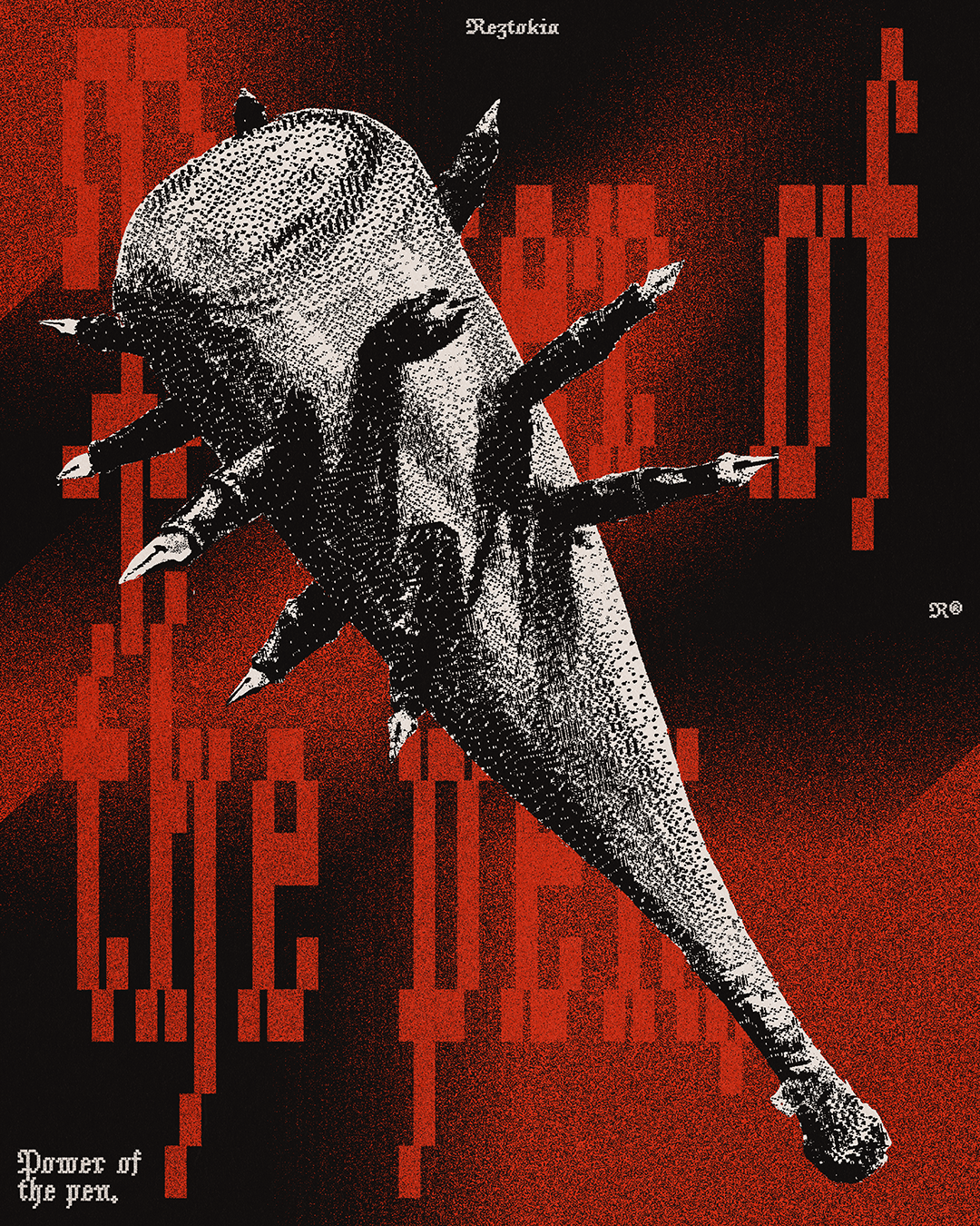
I love negative space sometimes. It's funny how you see the most random image and something jumps out in the negative space. Not my proudest moment when I noticed this stuff in the quotation marks, but here it is. I actually had this idea probably more than a year ago but at that time I wasn't able to come up with an aesthetic composition. That is probably the skill I've unintentionally progressed in the most in the past few months. The most important lessons I've learned are that not every design needs detailed text and that padding doesn't always have to be equal on the top and bottom. These sound like minor things but sometimes letting go of perceived limitations opens up way more possibilities than the ones they were supposedly blocking, if that makes sense. Anyway, I hope you enjoy this one!


Let's start a project!
Talking Shit Poster

About This Poster
I came across this jacket and had a brainwave. The square enclosed back panel was the perfect place to put this design. The seams around the design gave the layout the context it needed to work properly, and the green patch in the middle of the brown surface reinforced the idea of a billiard table. Adding more green accents and tiny red details tied everything together.


Let's start a project!