Break The Cycle

About This Poster
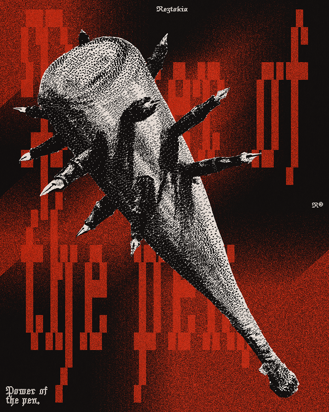
Lately, I've been really struggling with perfectionism. That is to say, I feel like I've set such a high standard for myself on social media, and everything has to be better than what I've done before. This is partly the reason why I've been so inactive lately; I've also been really busy with a lot of client projects. This post's message is simultaneously its purpose: to break the cycle of not posting. In order to start challenging myself again, I'm trying to emulate the style of different notable designers with each poster. This one is a study on the style of Reid Miles, an innovative American designer active during the 60s. I hope you enjoy this one! And stay tuned for more stuff soon.


Let's start a project!

Break The Cycle

About This Poster
I came across this jacket and had a brainwave. The square enclosed back panel was the perfect place to put this design. The seams around the design gave the layout the context it needed to work properly, and the green patch in the middle of the brown surface reinforced the idea of a billiard table. Adding more green accents and tiny red details tied everything together.


