
Power of the pen
About This Poster
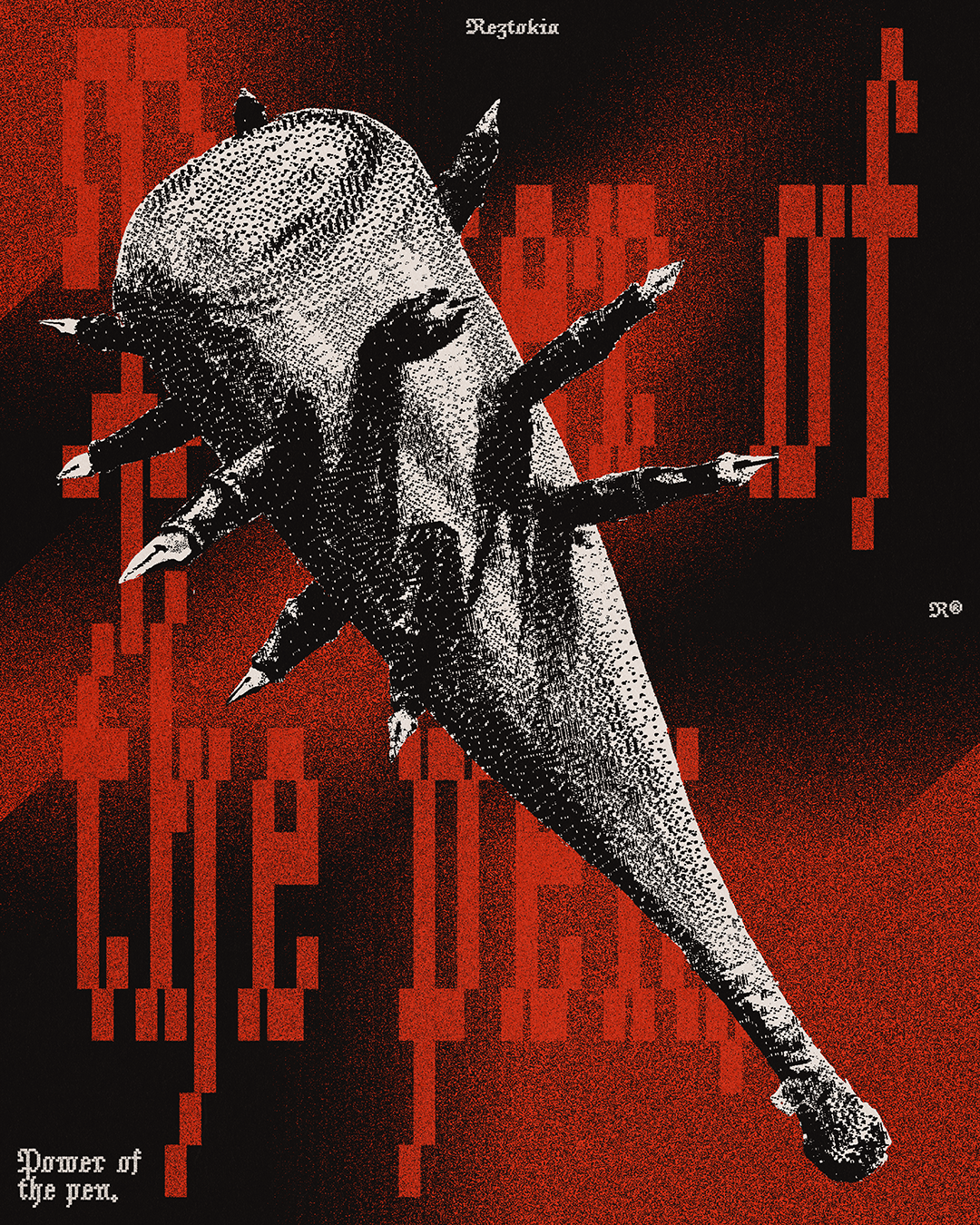
This poster was really a battle from the original idea to a visual execution I actually liked. I started doing a full-on painting of the bat and pen artwork. This took quite a while to nail down the perspective and proportions of the bat, then to fully illustrate the artwork in an oil painting style. After this, I tried a whole bunch of ways to integrate this illustration into a design, but nothing looked right. I had to remind myself of a really important lesson: the sunk cost fallacy. Just because I’ve put in the work to make this illustration as realistic and aesthetic as possible doesn’t mean I have to use all of that work if it doesn’t benefit me. So I decided to turn the illustration into this grainy pixel style, which finally satisfied my aesthetic eye. The brutality of the pixel aesthetic and grainy gradients works well with the thematic concept of the baseball bat. Anyway, I hope you enjoy this one!


Let's start a project!
Power of the pen

About This Poster
I came across this jacket and had a brainwave. The square enclosed back panel was the perfect place to put this design. The seams around the design gave the layout the context it needed to work properly, and the green patch in the middle of the brown surface reinforced the idea of a billiard table. Adding more green accents and tiny red details tied everything together.


Let's start a project!